I'm coming back to you with a reporting feature which is particularly close to my heart. These are dynamic cross tables which are also known under the name of “Pivot Tables”. If I think about it, I would say that this is the tool I use the most as part of my day-to-day analysis reports.
As mentioned in a previous post, its advantage compared to other methods of reporting is clearly its flexibility.
How do you produce a pivot table simply?
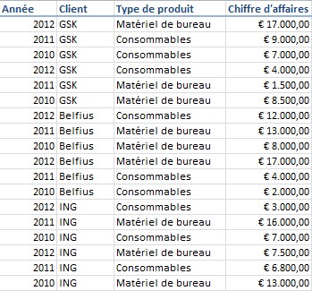
Here are some simple data items chosen to illustrate the explanation for you. The idea is to put in a table the turnover achieved per year, per customer and per type of product. In principle, very simple to obtain using the ledger feature in Adfinity.

What are the questions that I asked myself when I see this simple table?
- What is the change in my turnover per year?
- Which customer generates the most turnover?
- What is the change in turnover per year but broken down by customer?
- What is the type of product that works the best?
This is how to do it in Excel:
- You select your table, taking care to take in your column titles in this selection
- In Excel 2010, you click on the Insert menu and choose the Pivot Table option
- Excel uses the set of data selected to generate the pivot table. Choose to put the table into the current sheet.
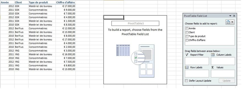
You will then get this:

Your turn to have a play! Arrange (using drag & drop) the columns in your table as you want them to be in the 4 areas at your disposal (report, column, line, value filter).
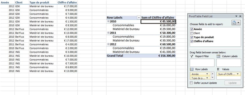
E.g.:

In 3 clicks you will get a turnover per year with a breakdown by type of product.
Would you rather have a breakdown by customer rather than by type of product? Nothing is more simple! Swap the Customer and Type of Product columns and that's all there is to it ;-).
Have fun!
Be aware that your consultant is also an Excel expert and can help you in producing your reports ;-).


